Sign-in Page
A customizable sign-in UI component that abstracts away the pain needed to wire together a secure authentication page for your application.
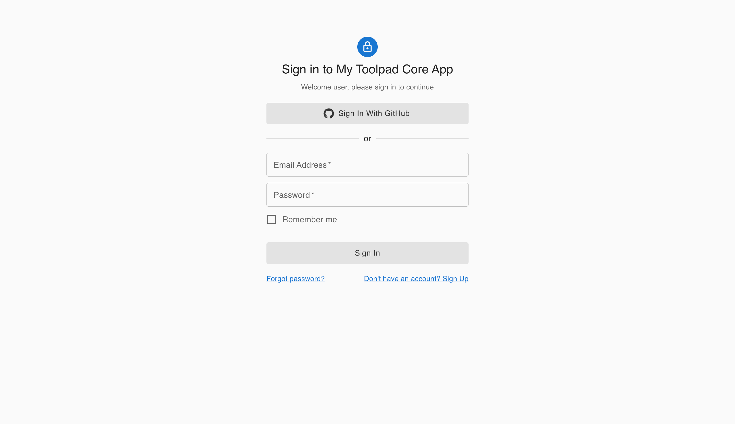
The SignInPage component is a quick way to generate a ready-to-use authentication page with multiple OAuth providers, or a credentials form.
Basic Usage
import { AppProvider } from '@toolpad/core/AppProvider';
import { SignInPage } from '@toolpad/core/SignInPage';

export default function App() {
  return (
    <AppProvider>
      <SignInPage
        providers={[...]}
        signIn={async (provider) => {
          // Your sign in logic
        }}
      />
    </AppProvider>
  );
}
OAuth
The SignInPage component can be set up with an OAuth provider by passing in a list of providers in the providers prop, along with a signIn function that accepts the provider as a parameter.
Magic Link
The SignIn page component supports magic links. To enable this, you have to set up a provider such as Auth.js NodeMailer. See more details in the Auth.js docs on database setup for email and Nodemailer configuration.
To render a magic link form, pass in a provider with nodemailer as the id property.
Passkey
The SignInPage component can be set up to use Passkeys by passing in a provider with passkey as the id:
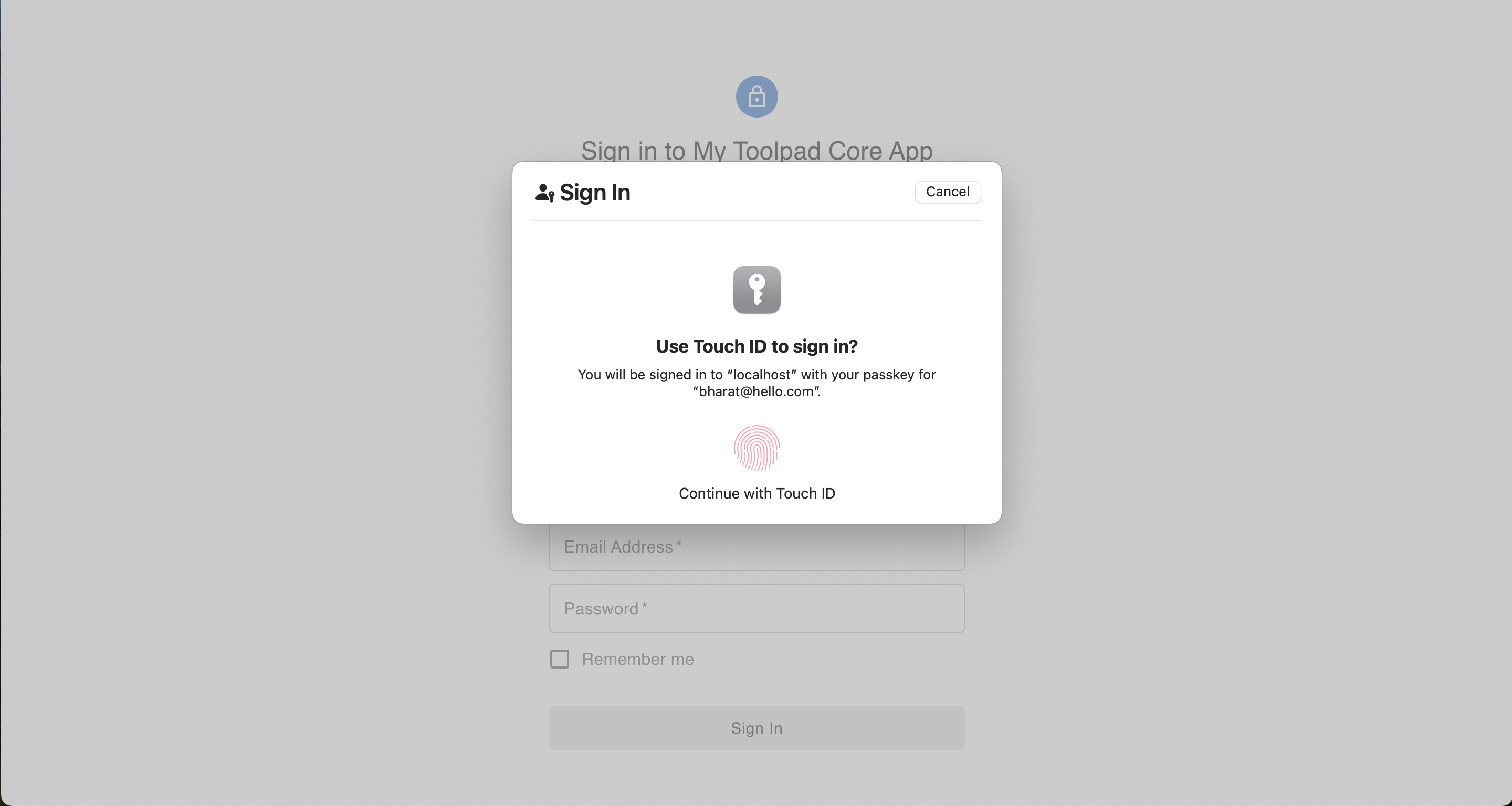
Auth.js Passkeys & Next.js App Router with Toolpad Core Sign-in page
Credentials
To render a username password form, pass in a provider with credentials as the id property. The signIn function accepts a formData parameter in this case.
Alerts
The signIn prop takes a function which can either return void or a Promise which resolves with an AuthResponse object of the form:
interface AuthResponse {
  error?: string;
  type?: string;
}
This renders an alert with the error string as the message.
Usage with authentication libraries
Auth.js
Next.js App Directory and GitHub
The component is composable with any authentication library you might want to use. The following is a SignInPage with Auth.js using GitHub, Next.js App Router and server actions.
Auth.js & Next.js App Router with Toolpad Core Sign-in page
Setting up
If you're using create-toolpad-app, or the Next.js app directory example, Auth.js is already installed. To proceed, add AUTH_SECRET to the environment variables by running:
npx auth secret
Otherwise, follow the detailed Auth.js installation instructions.
GitHub configuration
To get the required credentials, create an application in the GitHub developer settings. Read this guide on Auth.js on how to obtain those.
If you already have a CLIENT_ID and CLIENT_SECRET, you can skip this step and add them to the environment variables, like so:
GITHUB_CLIENT_ID=<your-client-id>
GITHUB_CLIENT_SECRET=<your-client-secret>
Server Configuration
If you're using create-toolpad-app, or the default Next.js app directory example, this server configuration is already set up for you.
Otherwise, follow the custom sign in page instructions to set up the server configuration.
The SignInPage component can slot in as a custom sign-in page inside Auth.js:
// ...
export const { handlers, auth, signIn, signOut } = NextAuth({
  providers,
  secret: process.env.AUTH_SECRET,
  pages: {
    signIn: '/auth/signin', // you can customize this based on your requirement
  },
// ...
To have a fully built "Sign in with GitHub" page appear at the /auth/signin route, add SignInPage to page.tsx:
// ...
import * as React from 'react';
import { SignInPage, type AuthProvider } from '@toolpad/core/SignInPage';
import { AuthError } from 'next-auth';
import { providerMap, signIn } from '../../../auth';

export default function SignIn() {
  return (
    <SignInPage
      providers={providerMap}
      signIn={async (
        provider: AuthProvider,
        formData: FormData,
        callbackUrl?: string,
      ) => {
        'use server';
        try {
          return await signIn(provider.id, {
            ...(formData && {
              email: formData.get('email'),
              password: formData.get('password'),
            }),
            redirectTo: callbackUrl ?? '/',
          });
        } catch (error) {
          if (error instanceof Error && error.message === 'NEXT_REDIRECT') {
            throw error;
          }
          if (error instanceof AuthError) {
            return {
              error:
                error.type === 'CredentialsSignin'
                  ? 'Invalid credentials.'
                  : 'An error with Auth.js occurred.',
              type: error.type,
            };
          }
          return {
            error: 'Something went wrong.',
            type: 'UnknownError',
          };
        }
      }}
    />
  );
}
Firebase
Vite with React Router
Setting up
You need to create a .env file in the root of your project directory with the following environment variables:
VITE_FIREBASE_API_KEY=
VITE_FIREBASE_AUTH_DOMAIN=
VITE_FIREBASE_PROJECT_ID=
VITE_FIREBASE_STORAGE_BUCKET=
VITE_FIREBASE_MESSAGE_SENDER_ID=
VITE_FIREBASE_APP_ID=
Customization
Branding
You can add your own branding elements to the SignInPage through the branding prop in the AppProvider:
Theme
Through the theme prop in the AppProvider, the SignInPage can be deeply customized to match any theme:
Slots
To enable deep customization beyond what is possible with custom props, the SignInPage component allows bringing your own custom granular components, such as inputs, checkboxes and buttons.
You can use the slotProps prop to pass props to the underlying components of each slot, and also to the form element:
Localization
Beyond the global localization options possible, you can customize the labels of the SignInPage using the localeText prop:
🚧 Layouts
The SignInPage component has versions with different layouts for authentication - one column, two column and others such. The APIs of these components are identical. This is in progress.
🚧 Other authentication flows
Besides the SignInPage , the team is planning work on several other components that enable new workflows such as sign up and password reset.
API
See the documentation below for a complete reference to all of the props and classes available to the components mentioned here.